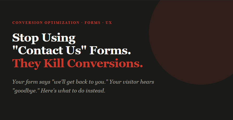
Stop using Contact Us forms. They kill conversions quietly.
Created: 19/03/2026
A few months ago, a SaaS founder showed me his analytics. Traffic was healthy - 4,200 monthly visitors, decent SEO. But his contact form is submitted maybe 12 times a month. He couldn't figure out why. The form looked clean. The copy was friendly. The button said, "Send Message."
The problem wasn't the form's design. It was the form itself.
What's actually happening when someone lands on that form
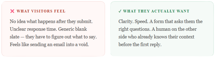
Think about it from the visitor's side. They've read your landing page, watched a demo clip, and they're curious - maybe even ready. They click "Contact Us." Then they see a blank form: Name, Email, Message. No guidance. No promise of what happens next. No signal of how quickly you'll respond.
So they freeze. They start writing something. Delete it. Think "I'll come back to this." And they never do.
The form doesn't just lose conversions. It creates the illusion you're accessible while actually being passive.
The psychology behind form drop-offs
There are three specific psychological moments where a generic contact form loses people. Understanding these helps you design around them.
The effort calculation
Before anyone types a single character, they unconsciously estimate how much effort this will take versus how much value they'll get. A blank textarea signals: "I don't know how much effort this will take." Uncertainty triggers avoidance. Structured forms - where someone can see clearly what's asked - lower that estimate dramatically.
The trust gap
A generic contact form offers no social proof, no response time promise, and no signal that a real human is on the other end. When you ask for someone's email without context, they imagine a ticket queue, a 5-day wait, or an auto-reply from a "Do Not Reply" address. The form, by being generic, signals that you don't have a process.
The commitment threshold
Clicking "Contact Us" feels like a big commitment if the visitor doesn't know what "contact" means in this context. Does it mean a sales call? A newsletter? A free trial? An invoice? Removing that ambiguity - even with a single line of context - increases completion rates significantly.
What "Contact Us" signals to your visitor
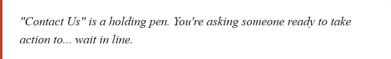
Language matters more than most people realize on forms. "Contact Us" is a phrase that centers your business, not the visitor. It says: come to us, on our terms, through our process.
Compare that to alternatives like:
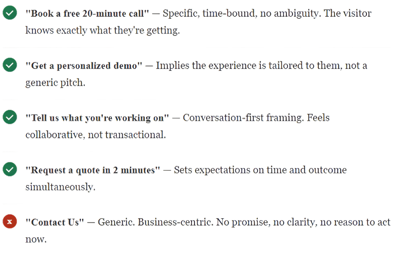
The heading of your form is also a conversion element. Most businesses treat it as a label. It should function as a micro-headline — a single line that reassures the visitor, sets context, and gives them a reason to keep reading.
What to do instead: the ActionForm approach
ActionForm is built on one idea - a form should guide someone to take action, not just collect their information. Instead of a blank "Message" field, you give people a structured path based on what they're actually trying to do.
Here's what that looks like in practice:
Start with intent, not identity
Don't open with Name + Email. Open with a question like "What brings you here?" with three clear options: I want a demo, I have a billing question, I want to partner with you. Now the visitor self-selects, and you already know their context before you read a single word of their message.
Ask only what the next step requires
A demo request needs a name, email, and company size. A support query needs a name, email, and what went wrong. Showing everyone the same blank "Message" box means you're always starting from zero. Conditional fields based on their intent cut back and forth by half.
Give a clear promise on the submit button
Change Send Message to something like Request a Demo → We'll reply in 2 hours. That one change - adding a time commitment - consistently lifts submissions. People don't want to send a message into a void. They want to know it lands somewhere real.
Make the confirmation page do work
Most "Thank you for contacting us" confirmation pages are dead ends. Use them. Show a relevant case study. Offer a calendar link while they wait. Ask one qualifying question you didn't ask in the form. That page has 100% read rate from people who just showed intent - it's your highest-value real estate.
Five form types that convert better than "Contact Us"
Depending on your business model and conversion goal, here are five specific form types that consistently outperform the generic contact form:
The demo request form
Best for: SaaS, B2B software, enterprise tools. Ask for intent, company size, current tool in use, and work email. The CTA should name the demo specifically - "Book a 20-minute product walkthrough" - not just "Request a demo." Include a calendar embed directly in the confirmation step so the visitor can book a slot immediately rather than waiting for your reply.
The quote calculator form
Best for: agencies, service businesses, and custom pricing. Instead of "Tell us about your project," walk the visitor through a step-by-step estimator. Ask: What type of project? What's the timeline? What's the rough budget range? Each answer narrows the next question. At the end, give a ballpark range before asking for their email. The lead comes in pre-qualified, and the visitor feels like they got something before giving you anything.
The problem-first form
Best for: consulting, coaching, professional services. Lead with "What's the biggest challenge you're trying to solve right now?" as a multiple-choice question, not a free-text box. Let them pick the closest match. Then ask follow-up questions based on their selection. This form type works because it frames the conversation around the visitor's problem, not your service offering.
The triage form
Best for: companies with distinct customer types (enterprise vs SMB, or multiple use cases). The first question is always: "Which of these describes you best?" Sales, Support, Press, Partnership. Each route shows a completely different form with different fields, different CTAs, and different response time promises. Visitors feel seen. Your team gets pre-sorted leads.
The audit or assessment form
Best for: SEO agencies, HR platforms, financial services, and any business where the visitor benefits from a diagnostic. Ask five to seven quick questions about their current situation. At the end, tell them you'll prepare a personalized audit or assessment based on their answers. The form becomes a value proposition in itself — they're not filling it out to contact you, they're filling it out to get something useful.
A real example, before and after
One B2B software company replaced its generic contact form with an ActionForm setup. Old version: Name, Email, Message, a "Contact Us" header, and a generic blue button.
New version: Three intent buttons upfront, conditional follow-up questions based on selection, response time shown on the button ("Request a Demo - Reply within 4 hours"), and a confirmation page with a Calendly link.
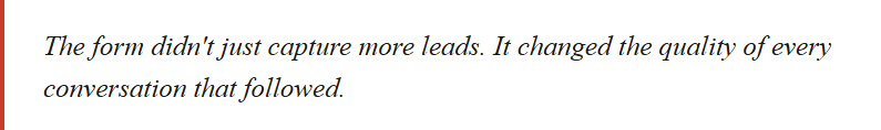
Submissions went from 12 a month to 47 in the first month. More importantly, the team stopped playing email ping-pong. Every submission came in with enough context to give a useful first reply.
One thing to remember
People don't fill out forms because they enjoy it. They fill them out because they want something - a demo, an answer, a solution. Your form's job is to make that path as short and clear as possible.
"Contact Us" says you want something from them - their information. ActionForm says you're here to help them get what they came for. That shift in framing changes everything about how someone experiences your site.
So yes - retire the blank box. It's not doing you any favors.
Build your first ActionForm
Set up intent-based forms that convert - no developer needed.