What is Conversational Form and How It Differs from Static Forms
Created: 28/01/2026
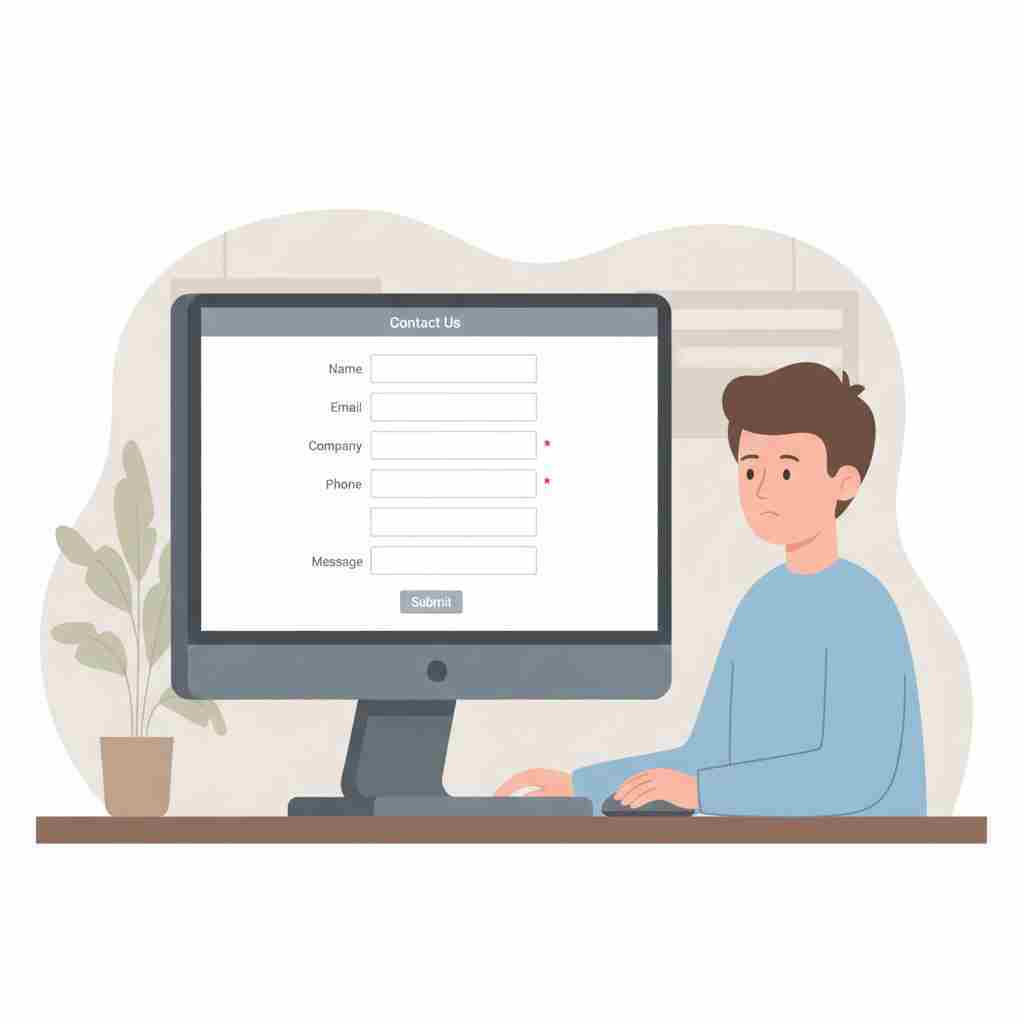
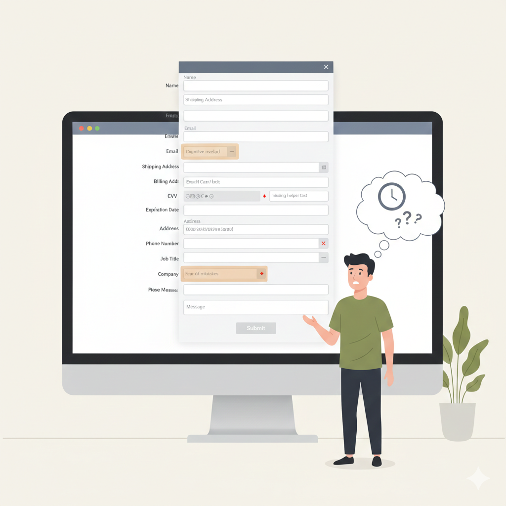
Remember the last time you filled out a form online? Let me guess: you stared at a wall of empty boxes, dropdown menus, and required field asterisks. Maybe you abandoned it halfway through because it felt like homework.
That's a static form. And honestly, it's getting old.
Test Conversational Forms on One Page
Turn a static form into a conversation and experience the difference in flow, clarity, and responses.
What Is a Conversational Form
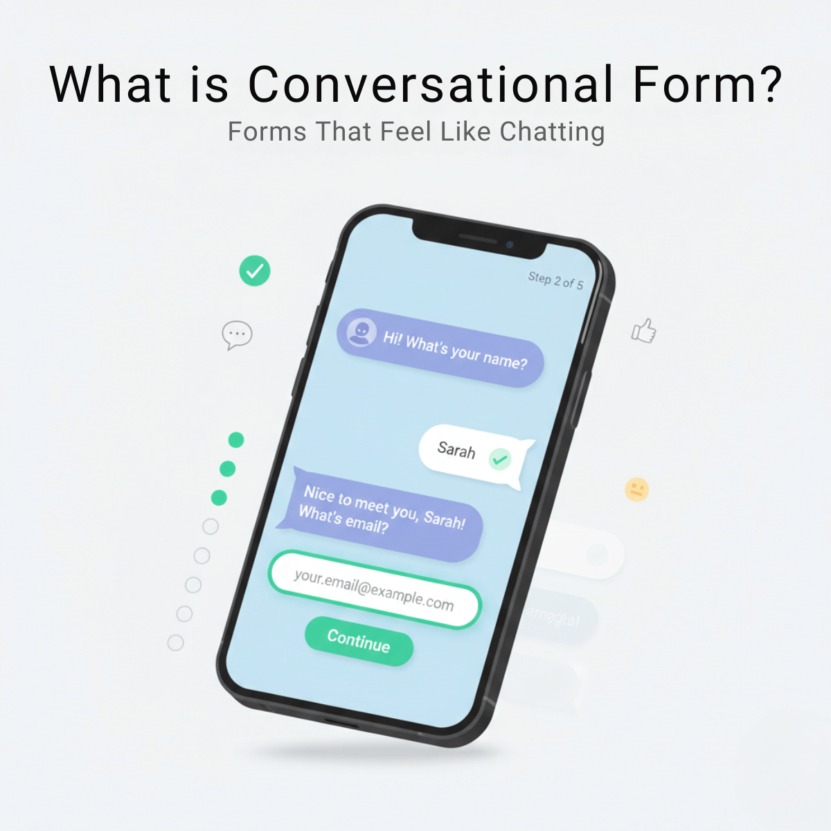
A conversational form collects information through a chat-style interface. Instead of showing all fields at once, it asks one question at a time and reacts to the user’s answers.
Think of it as a guided conversation.
You see a question.
You respond.
The form adapts and moves to the next step.
The experience feels closer to messaging on WhatsApp or chatting with support than filling out a spreadsheet.
Example
Instead of seeing ten fields at once, the form starts with
What is your name
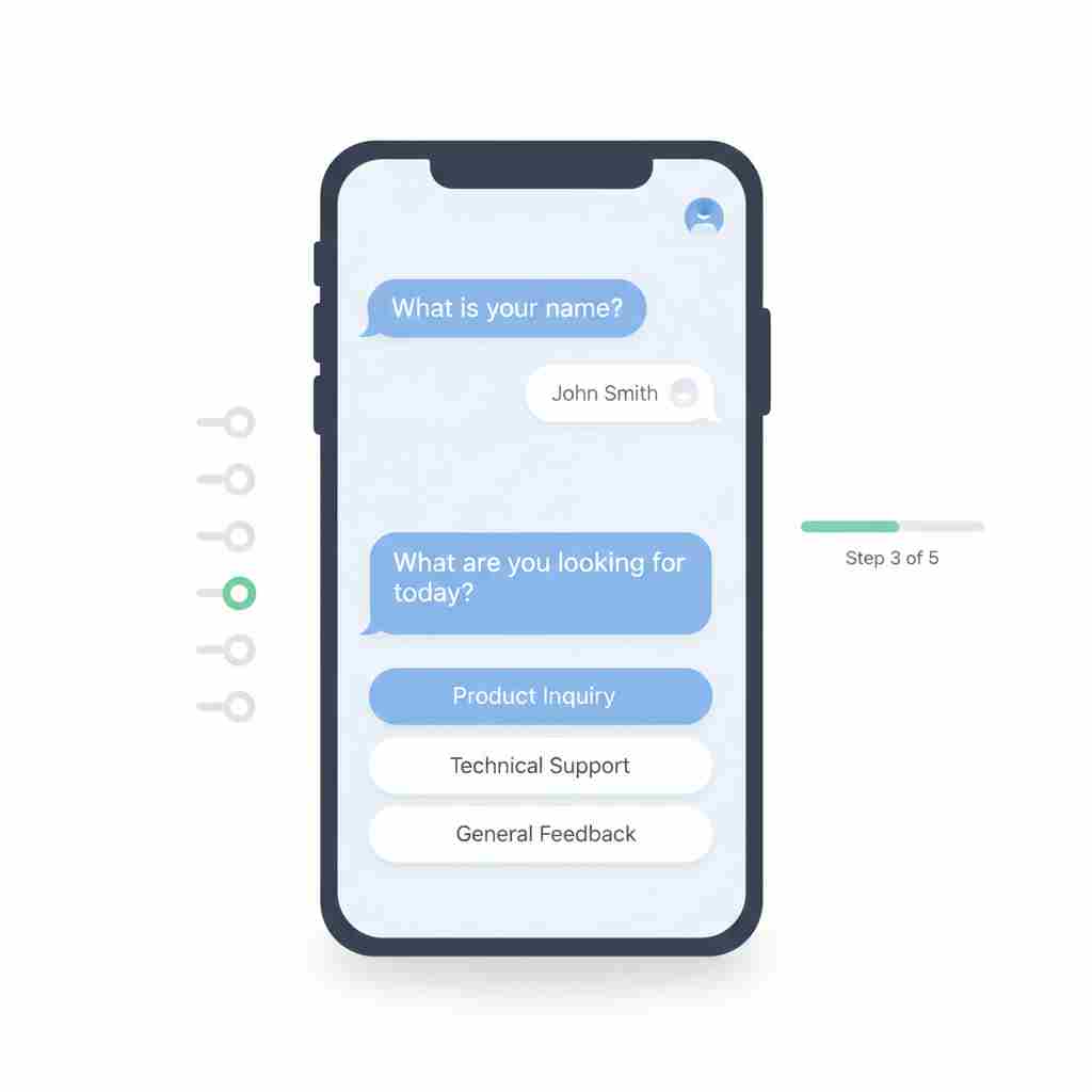
After you answer, it asks
What are you looking for today
Then it continues based on your reply.
What Is a Static Form
A static form shows every field upfront. The structure stays the same for every visitor.
• Name
• Company
• Phone
• Message
You scan the page, decide whether it feels worth the effort, then either fill it out or leave.
Static forms are predictable and simple to build. They are also easy to ignore.
The Static Form Problem
Static forms have been around since the early days of the web. You know the type: contact forms, registration pages, checkout screens. Everything appears at once in a structured layout.
Here's what typically happens:
A user lands on your page, sees a long form, and their brain does a quick calculation. "How much time will this take? Do I really need this?" Research from the Baymard Institute shows that the average cart abandonment rate sits at 70.19%, with complicated checkout processes being a major contributor.
Static forms create friction in three ways:
Cognitive overload. When someone sees 10+ fields, they need to process all of them before starting. This mental load often leads to procrastination or abandonment.
No context. Static forms can't explain why they need certain information until after you've already started filling them out. The logic only becomes clear retrospectively.
Error anxiety. Users worry about making mistakes because they can see all the places where things might go wrong. This creates hesitation.
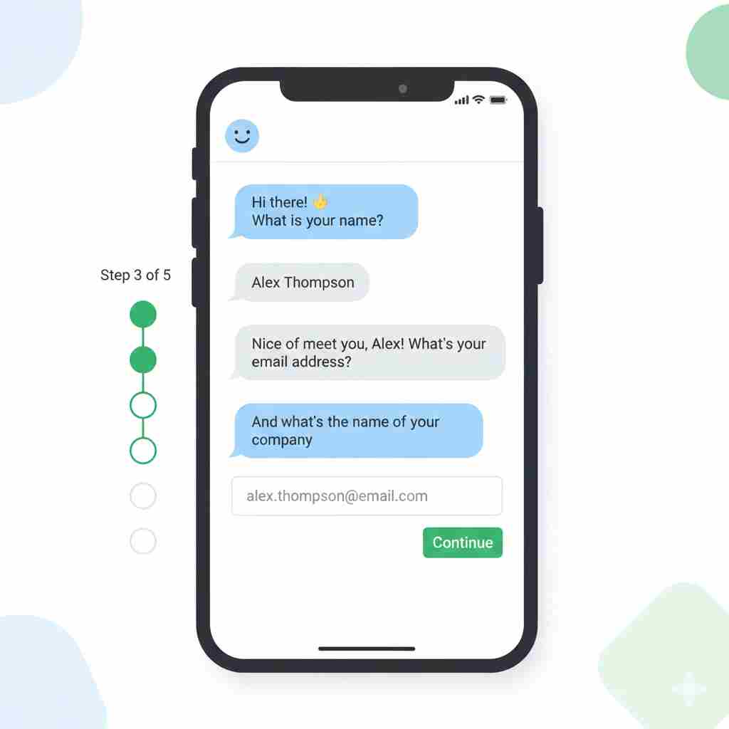
How Conversational Forms Work
Conversational forms break the process into individual steps. Each screen shows one question. You answer, and the next question appears.
Here's a simple example. Instead of this static layout:
• Name: ______
• Email: ______
• Phone: ______
• Company: ______
• Job Title: ______
• Message: ______
A conversational form would flow like this:
"Hi! What's your name?" [User types: Sarah]
"Nice to meet you, Sarah. What's your email?" [User types: john@example.com]
"Got it. What company do you work for?" [User types: Acme Corp]
You see the difference. One question at a time. A sense of progress. A feeling that someone's actually listening.
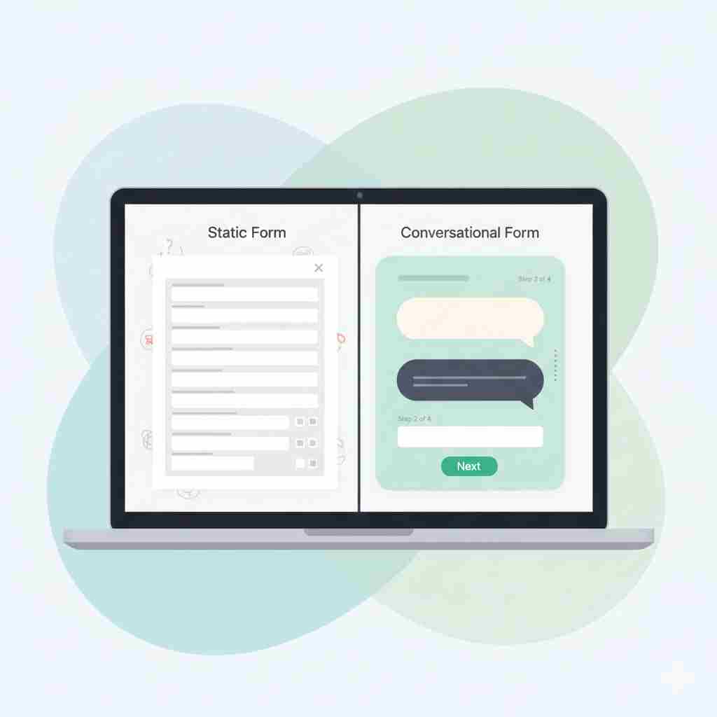
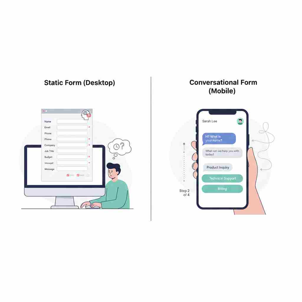
The Core Difference at a Glance
Static form
• All questions visible at once
• User controls the pace
• Same path for everyone
• Higher cognitive load
• Lower completion on long forms
Conversational form
• One question at a time
• Form controls the flow
• Dynamic paths based on answers
• Lower cognitive load
• Higher completion on long forms
When Each Format Makes Sense
Static forms still have their place. If you need someone to fill out a very short form (two or three fields), going conversational might actually add unnecessary clicks. A simple newsletter signup with just an email field? Keep it static.
Static forms also work well when users are highly motivated and already committed. If someone's applying for a job, they expect a comprehensive application. They've mentally prepared for it.
But conversational forms shine when:
You're asking for sensitive information. Breaking it into steps reduces the intimidation factor. A multi-step mortgage application feels less daunting than a 40-field monster form.
Your audience isn't motivated yet. Lead generation forms, surveys, and discovery calls benefit from the conversational approach because it eases people into sharing information.
You need better data quality. When people focus on one question at a time, they give more thoughtful answers. You're not racing through fields just to finish.
You want to create an experience. Brands that prioritize user experience use conversational forms to differentiate themselves. It signals that you care about how people feel while interacting with you.
Real Results from Real Companies
Leadformly tested this extensively. They found that multi-step (conversational style) forms converted 86% higher than single-step static forms. Their clients saw this pattern consistently across industries.
G2, the software review platform, rebuilt its demo request form using a conversational approach. They saw a 27% increase in conversion rates within the first month.
These aren't flukes. When you reduce friction and create a better experience, people respond.
Common Mistakes to Avoid
Don't make your conversational form too long. Yes, the format helps with completion, but 30 steps is still 30 steps. Be ruthless about what you actually need to know.
Don't forget to let users go back. People change their minds or notice typos. Always include a "Previous" button.
Don't lose the data if someone closes their browser. Implement save functionality so users can return and finish later, especially for longer forms.
Don't ignore loading times between steps. If each new question takes three seconds to appear, you'll frustrate users. Optimize your form to transition smoothly.
What This Means for Your Business
Forms are gatekeepers. They stand between you and your potential customers, subscribers, or users. A bad form experience costs you conversions, plain and simple.
Conversational forms won't solve every problem. If your offer isn't compelling or your traffic is poor, changing your form format won't fix that. But if you're already getting decent traffic and people are starting your forms but not finishing them, this approach can make a measurable difference.
The psychology is straightforward. When something feels easier and more pleasant, people are more likely to complete it. Conversational forms tap into how we naturally prefer to share information.
You don't need to convert every form on your site. Start with one. Maybe your lead capture form or your contact page. Build it, test it, measure the results. Compare completion rates, data quality, and user feedback.
Most companies that try conversational forms stick with them. Once you see the completion rate difference, it's hard to go back to making people fill out a giant static form.
The web is slowly becoming more human. More conversational. More focused on experience rather than just function. Your forms can be part of that shift.
Build Your First Conversational Form
Replace long static forms with a guided, chat-style experience that people actually want to complete.