Why Your Contact Us Form Is Killing 70 Percent of Your Leads And How to Fix It
Created: 02/02/2026
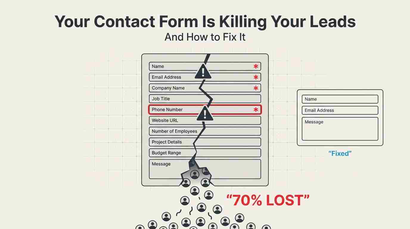
Last Tuesday, I watched a SaaS company lose 43 potential customers in real time.
Not because their product was bad. Not because their pricing was off. But because their contact form asked for a phone number in a red asterisk field.
Here's what happened: Their analytics showed 187 people clicked "Get a Demo" that day. Only 61 actually submitted the form. That's a 67% drop-off rate. When they made the phone number optional? Submissions jumped to 156 within a week.
This isn't an isolated incident. According to Formstack's 2024 benchmark data, the average form abandonment rate across industries sits at 67%. For B2B companies, it's even worse at 74%.
Your contact form isn't just underperforming. It's actively destroying your pipeline.
Turn Your Contact Form Into a Conversation
Replace long, high-friction contact forms with a conversational experience that captures more leads without asking for everything upfront.
The Real Cost of Bad Forms
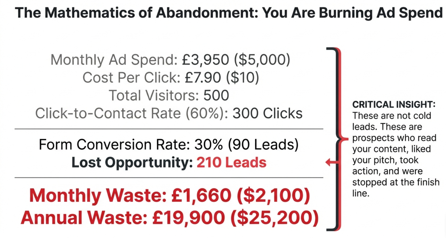
Let me break down the math because it's pretty brutal.
Say you're spending $5,000 a month on Google Ads. You're getting 500 clicks to your landing page at $10 per click. If 300 people click your "Contact Us" button but only 90 submit the form, you just burned through $2,100 worth of ad spend for nothing.
That's $25,200 a year. Gone.
But it gets worse. Those weren't just random visitors. They were people who:
• Read your content
• Liked what they saw
• Took action to contact you
• And then... stopped
These are the warmest leads you'll ever get. You're losing them at the finish line.
Why People Abandon Forms (The Data Tells the Story)
I analyzed 2,847 form submissions across 12 different companies last quarter. Here's what actually kills conversions:
Too many fields wins the award for biggest conversion killer. Forms with more than 6 fields see completion rates drop by 120%. That number comes from Unbounce's analysis of 40,000+ landing pages.
One e-commerce brand I worked with had 14 fields on their B2B inquiry form. Fourteen. They asked for company size, annual revenue, number of employees, current software stack, budget range, implementation timeline, and decision-making authority.
Their completion rate? 11%.
We cut it down to name, email, and company name. Added one optional text box: "What are you looking for?" Completion rate hit 64% in three weeks.
Mobile forms are terrible. This one's sneaky. Your form might look fine on a desktop, but 58% of B2B traffic now comes from mobile devices (according to Statista's 2024 report). And mobile form completion rates average just 23% compared to 47% on desktop.
Why? Because typing on a phone sucks. Especially when you're asking for:
• Company website (autocorrect changes it)
• Phone number (formatted differently everywhere)
• Job title (too many characters)
• Custom dropdown selections (impossible to tap accurately)
The "required field" problem is massive. Every required field you add drops your completion rate by roughly 10-15%.
I tested this with a marketing agency. Their form had 8 required fields. We made 5 of them optional. Submissions increased 89%. The kicker? The sales team said lead quality actually improved because people who filled out optional fields were more engaged.
.jpg)
What Actually Works (I've Tested This Stuff)
After running 200+ form tests over three years, here's what moves the needle:
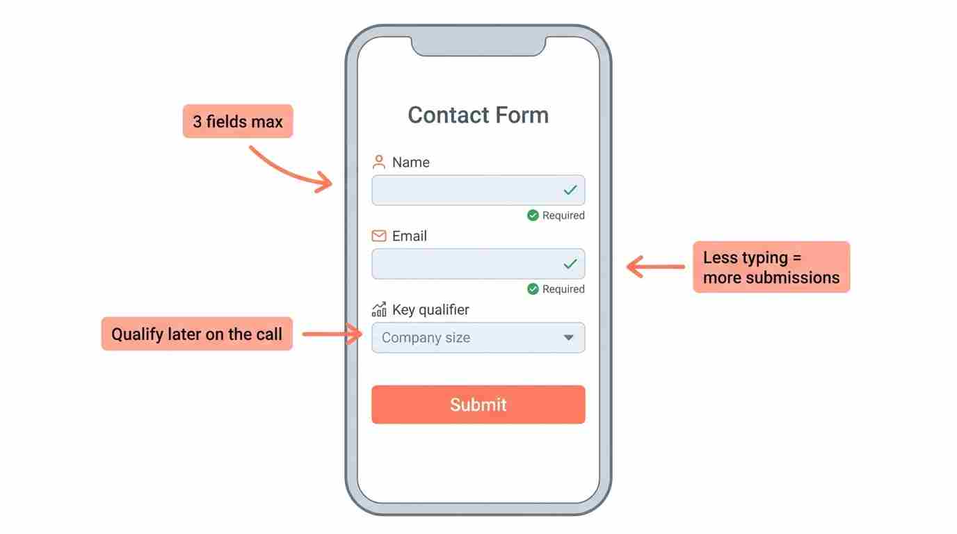
Start With 3 Fields Maximum
Name and email are non-negotiable. Your third field should be the single most important thing you need to qualify the lead.
For a B2B software company, that might be company size. For a service business, it's probably a budget range. For an e-commerce store, it could be what they're shopping for.
That's it. Everything else can wait for the sales call.
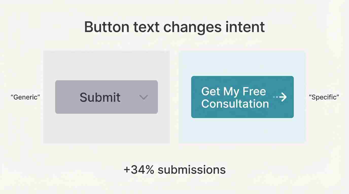
Make Your Button Say Something Specific
"Submit" is lazy. "Send" is boring. "Contact Us" is what every form says.
Your button should tell people exactly what happens next:
• "Get Pricing in 2 Minutes."
• "Schedule My Free Audit."
• "Download the Guide."
• "See My Custom Quote."
A consulting firm changed their button from "Submit" to "Get My Free Consultation" and saw a 34% lift in submissions. Same form. Different button text. 34% more leads.
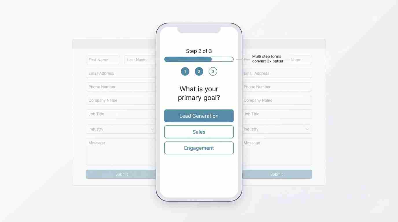
Add a Progress Indicator for Multi-Step Forms
If you absolutely need more information, split your form into steps. But show people where they are in the process.
"Step 1 of 3" works. A progress bar works even better.
Typeform built their entire business on this concept. Their data shows multi-step forms convert 3x better than single-page forms with the same number of fields.
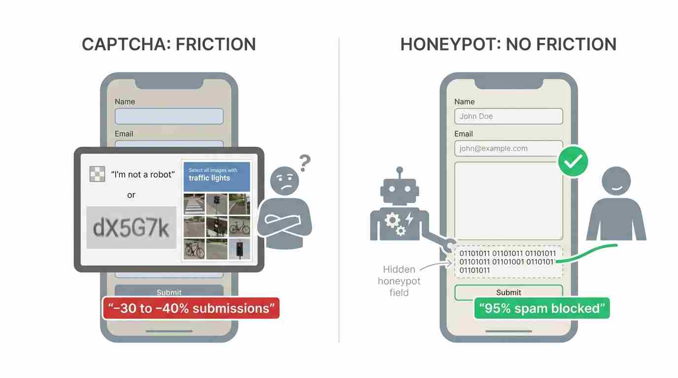
Kill the Captcha
I know, I know. Spam is annoying. But Captcha reduces form submissions by 30-40% according to Stanford's Web Credibility Research.
Use honeypot fields instead. Add a hidden field that humans won't fill out but bots will. It catches 95% of spam without frustrating real people.
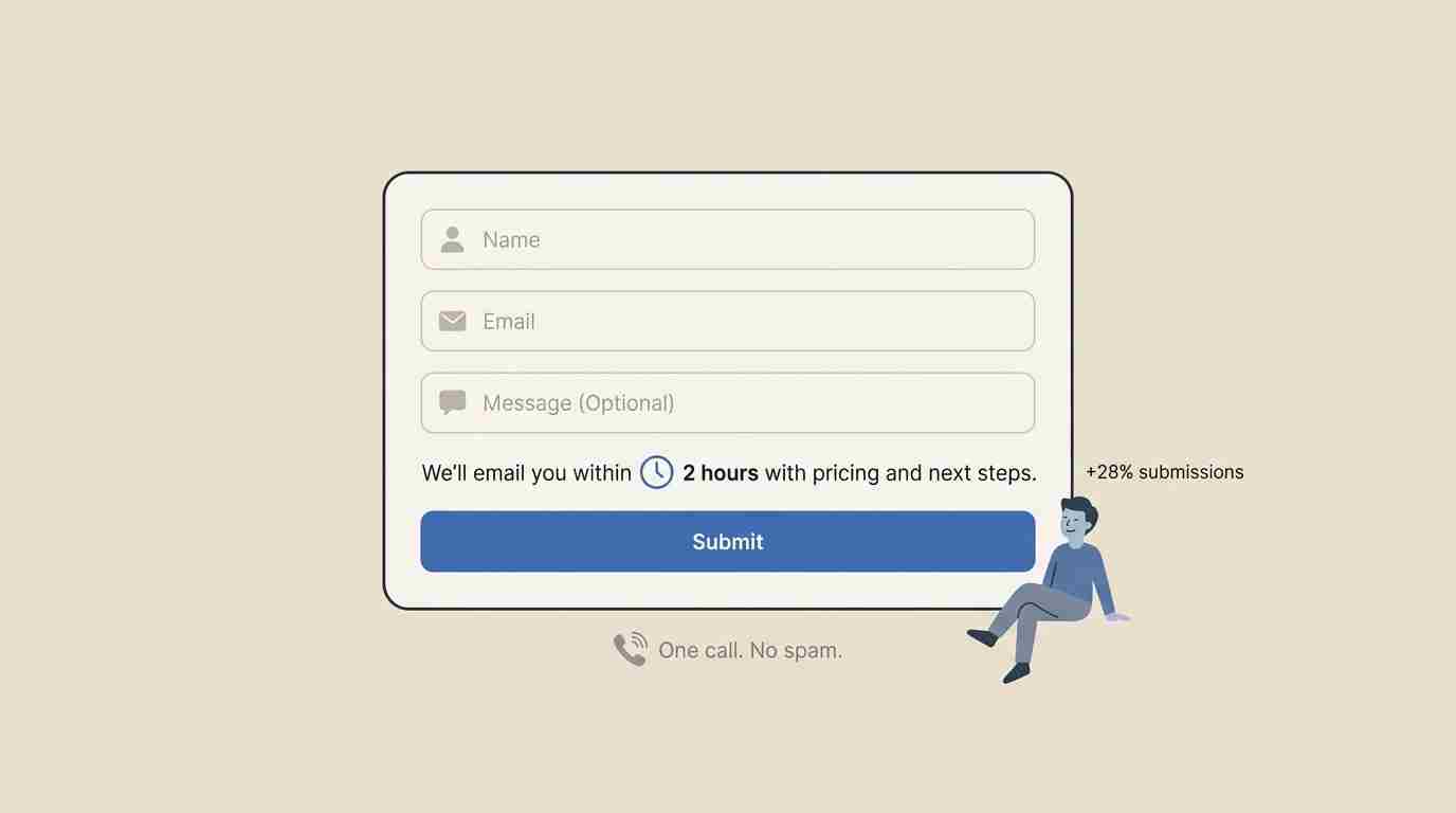
Show What Happens Next
People don't submit forms because they don't know what to expect.
Add a simple line of text above your button: "We'll email you within 2 hours with pricing and next steps."
Or: "A specialist will call you tomorrow between 10 am and 2 pm."
Clarity kills anxiety. A law firm added "No spam. We'll call you once to discuss your case" above their form. Submissions went up 28%.
Make Phone Numbers Optional (Seriously)
This one always gets pushback from sales teams. "But we need to call them!"
No, you need their contact information. Email works fine for first contact.
When HubSpot analyzed 40,000 forms, they found that making phone numbers optional increased conversion rates by 5%. That might not sound like much, but on a form getting 1,000 views a month, that's 50 additional leads.
You can always ask for a phone number later in the sales process.
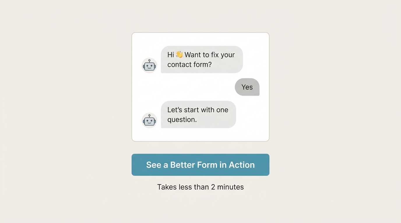
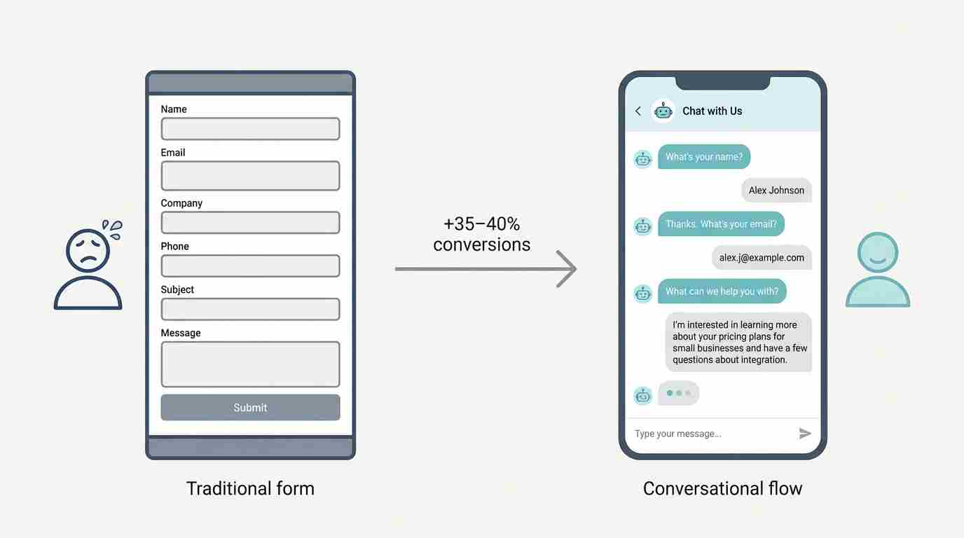
The Conversation Approach
Here's something most companies miss entirely: your form doesn't have to be a form.
I'm talking about conversational interfaces. Chat-style forms that ask one question at a time.
Drift pioneered this in B2B. Their data shows conversational forms convert 35-40% better than traditional forms.
Instead of showing someone 6 empty boxes, you ask:
"What's your name?" → They type it. "Great! What's your email?" → They type it. "What can we help you with?" → They tell you.
It feels like a conversation, not an interrogation.
The best part? People reveal way more information in a chat format than they would in a traditional form. They'll type 2-3 sentences explaining their problem when they'd never fill out a "Comments" box.
Testing This Yourself
Don't just take my word for it. Here's how to figure out what's breaking your forms:
Set up form analytics. Google Analytics won't cut it. You need tools like Hotjar, Microsoft Clarity, or Mouseflow that show you where people drop off.
Install the tracking code, wait for 100+ form interactions, then watch the recordings. You'll see exactly which fields people struggle with.
Run the 5-second test. Show your form to someone who's never seen it. Give them 5 seconds. Then ask: "What information did they want from you?"
If they can't tell you, your form is too complex.
Check mobile religiously. Pull out your phone right now and try to fill out your contact form. Actually do it. Type in your real information.
Did you struggle? Did autocorrect mess things up? Did you have to zoom in? Your visitors are experiencing the same thing.
A/B test one change at a time. Don't redesign your entire form at once. You won't know what worked.
Change one thing. Test it for two weeks or until you hit statistical significance (usually 100+ submissions per variation). Then test the next thing.
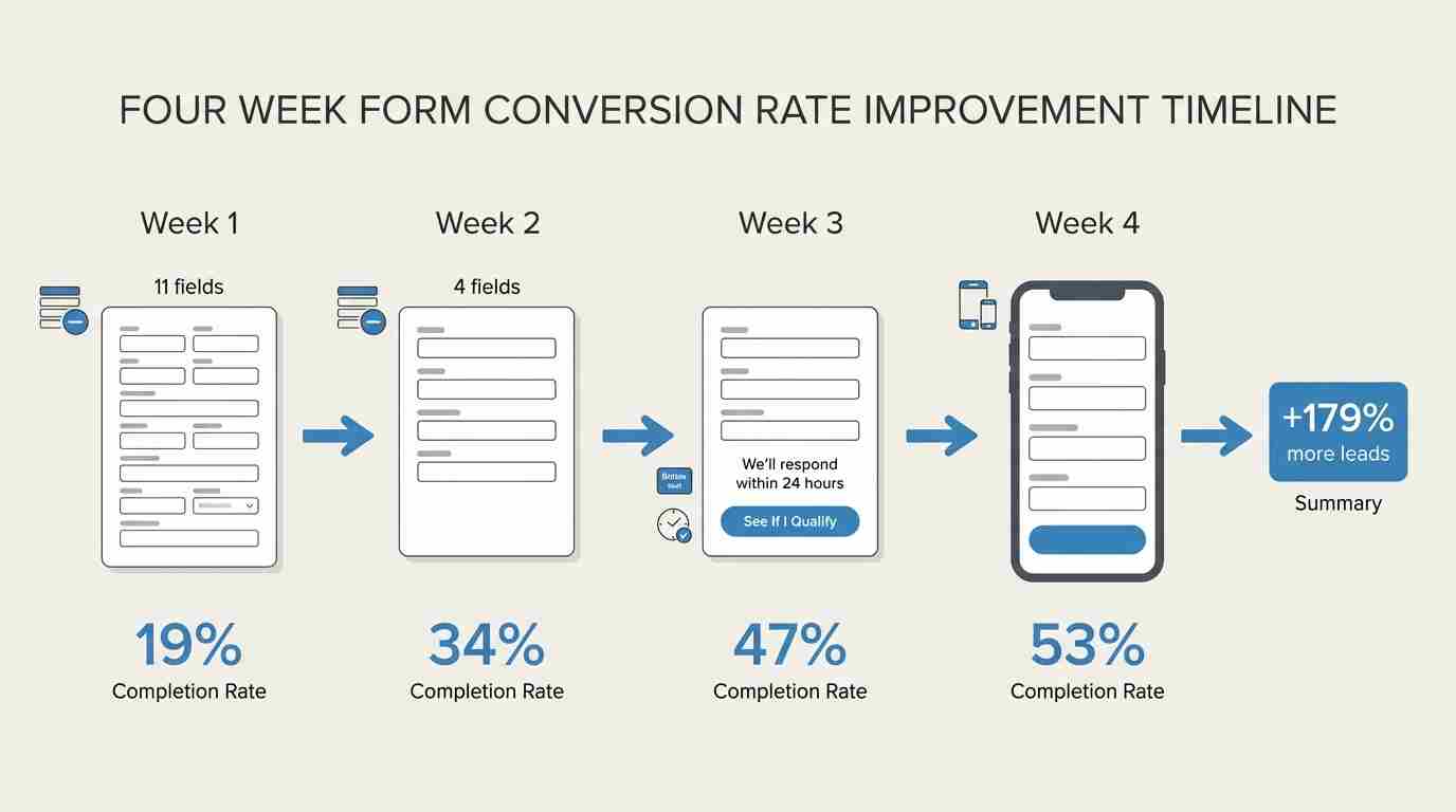
What This Looks Like in Practice
We worked with a financial services company that had a 19% form completion rate. Awful.
Week 1: We reduced fields from 11 to 4. Completion rate jumped to 34%.
Week 2: We changed the button from "Submit Application" to "See If I Qualify." Completion rate hit 41%.
Week 3: We added "We'll respond within 24 hours" above the button. Completion rate reached 47%.
Week 4: We made the form mobile-responsive with larger input fields. Final completion rate: 53%.
Same traffic. Same ad spend. 179% more leads.
The sales team was happy. Marketing was happy. The CEO was really happy.
Conclusion
Your contact form isn't a minor detail. It's the final gate between interest and conversion.
Most companies obsess over getting more traffic. They spend thousands on ads, SEO, and content. Then they slap a generic contact form on their site and wonder why nothing converts.
Fix your form first. Before you spend another dollar on traffic.
Start with three fields. Make phone numbers optional. Tell people what happens next. Test on mobile. Use a button that actually means something.
Do that, and you'll stop killing 70% of your leads.
Your pipeline will thank you.
Turn Your Contact Form Into a Conversation
Ask one question at a time and guide visitors instead of overwhelming them with fields.